✅ Article last checked: February 27, 2026, 05:36|👨⚕️ Verified by: Johnson J. Edwin|View History
Fast takeaway for interpretation:
Ask “rate or count?” before reacting to a number.
Check age structure before labeling a trend “good” or “bad.”
Confirm definitions before comparing places.
Everyday Situations Where Population Basics Show Up
Short answer: population and society basics become real when institutions must adapt to speed and composition of change—not just the total number of residents.
A school district builds new classrooms after several years of rising births; why this happens: cohort size moves like a wave through ages, creating predictable demand surges.
A hospital expands geriatric services even without major population growth; why this happens: aging can shift service needs faster than totals change.
A city sees transit crowding without “massive growth”; why this happens: job clustering and housing constraints concentrate daily movement into the same corridors.
A local labor shortage appears despite steady population size; why this happens: retirements and participation changes can reduce working-age availability.
Housing prices rise sharply in a few neighborhoods while the citywide population barely shifts; why this happens: migration often lands unevenly, and supply is neighborhood-specific.
Retail shifts from “family-sized” to “single-portion” products; why this happens: household size and age composition reshape demand patterns.
A region invests in language access and credential recognition after newcomer arrivals; why this happens: integration capacity affects whether migration becomes economic gain.
Rural clinics consolidate as young adults leave; why this happens: migration and aging can reduce local demand and raise service costs per resident.
Fast takeaway for daily life:
Speed of change can matter more than size.
Where people settle often matters more than “countrywide” totals.
Age mix is the hidden driver behind many budget debates.
Limitations And What We Still Don’t Know
Short answer: population data is powerful, but it has blind spots—especially where people are hard to count, definitions shift, or future behavior changes.
Undercounts and missing people: censuses can miss mobile, informal, or marginalized groups, affecting totals and rates.
Definition changes: updates to “urban,” household definitions, or boundaries can create artificial jumps.
Time lags: many official releases are delayed; fast-moving situations may be reflected late in annual series.
Projection uncertainty: long-run estimates depend on assumptions about fertility, mortality, and migration, which can shift with policy, economics, or shocks.
Hidden heterogeneity: national averages can mask huge differences by region, income group, or education level.
Two-sentence wrap-up: Population and society basics are best understood as a toolkit: a few clear measures can explain why places feel like they are changing faster than their totals suggest. The most reliable reading comes from combining rates, age structure, and definitions instead of leaning on a single headline number.
The most common mistake: treating a count as if it explains causes, without checking fertility, mortality, migration, and age composition.
A memorable rule:Always read population data as “who + where + how fast,” not just “how many.”
What is the difference between population and demographics?
Population is the size and structure of people in a place, while demographics usually refers to the characteristics used to describe them (age, sex, location, education, and more). Demographics is the descriptive lens; population is the underlying group being described.
Why do demographers prefer rates over raw numbers?
Rates standardize for population size, so comparisons become meaningful across places and time. A city can have fewer births than another but a higher birth rate, which can signal very different planning needs.
What does “replacement-level fertility” really mean?
It is the fertility level that would keep population size stable over the long run without migration, assuming mortality patterns typical of the context. It is often close to 2.1, but it can vary due to survival and sex ratio differences.
Can a population grow even if fertility is falling?
Yes. Population momentum can keep growth going if there are many young adults entering childbearing ages, and net migration can also raise totals even when births per woman decline.
What is the age dependency ratio used for?
It summarizes the number of people typically classified as “dependents” (under 15 and 65+) relative to working-age adults (15–64). It’s a helpful demographic signal, but it does not directly measure employment, productivity, or caregiving burden.
How reliable are population projections?
They are best read as scenario-based estimates built on assumptions about fertility, mortality, and migration. Projections are often reliable for broad direction over short-to-medium horizons, but uncertainty grows as the timeframe expands and conditions change.
Population and society basics cover how many people live in a place, how that number changes, and how the change ripples through everyday systems like housing, schools, and healthcare. A practical shortcut is births − deaths + net migration: this simple “demographic bookkeeping” helps explain most population shifts. With a few measures—such as fertility, life expectancy, and age structure—charts and headlines become easier to interpret and harder to misread.
What To Keep In Mind Right Away
Counts tell you “how many”; rates tell you “how fast.”
Age structure can keep growth going (or shrinking) even after fertility changes.
Definitions matter: “urban,” “resident,” and even “household” can differ by country and dataset.
Society shapes demography through education, health, work, housing, and norms—usually in context-specific ways.
Projections aren’t promises; they are scenario-based estimates built on assumptions.
Why this topic often feels confusing: population data is simple in arithmetic but complex in meaning. A small change in who is counted, where boundaries are drawn, or which ages are compared can flip the story.
If you remember one thing…Population numbers only make sense when paired with the social context that produces them—because the same birth rate or migration level can lead to very different outcomes depending on age structure, services, and constraints.
What “Population” And “Society” Mean In Practice
Short answer:Population is the measured size and structure of a group of people, while society is the network of institutions, rules, and everyday behaviors that shape how people live—and how population changes unfold.
In many datasets, total population is a de facto count: it includes residents in a territory regardless of legal status or citizenship, typically as a midyear estimate in global databases. This is why two “population” figures can differ slightly even when they describe the same place and year: the definition and timing (midyear vs. census day) can vary.
Population is not just a headcount: it includes age composition, geography, and distribution.
Society is not just culture: it includes schools, health systems, labor markets, and housing rules.
The link runs both ways: society shapes births, deaths, and migration, while demographic change reshapes institutions over time.
A small mental checkpoint: When a chart says “population is changing,” ask which component is driving it—fertility, mortality, or migration—and which ages are most affected.
Fertility changes the number of children born.
Mortality changes survival and life expectancy.
Migration can reshape cities and regions quickly.
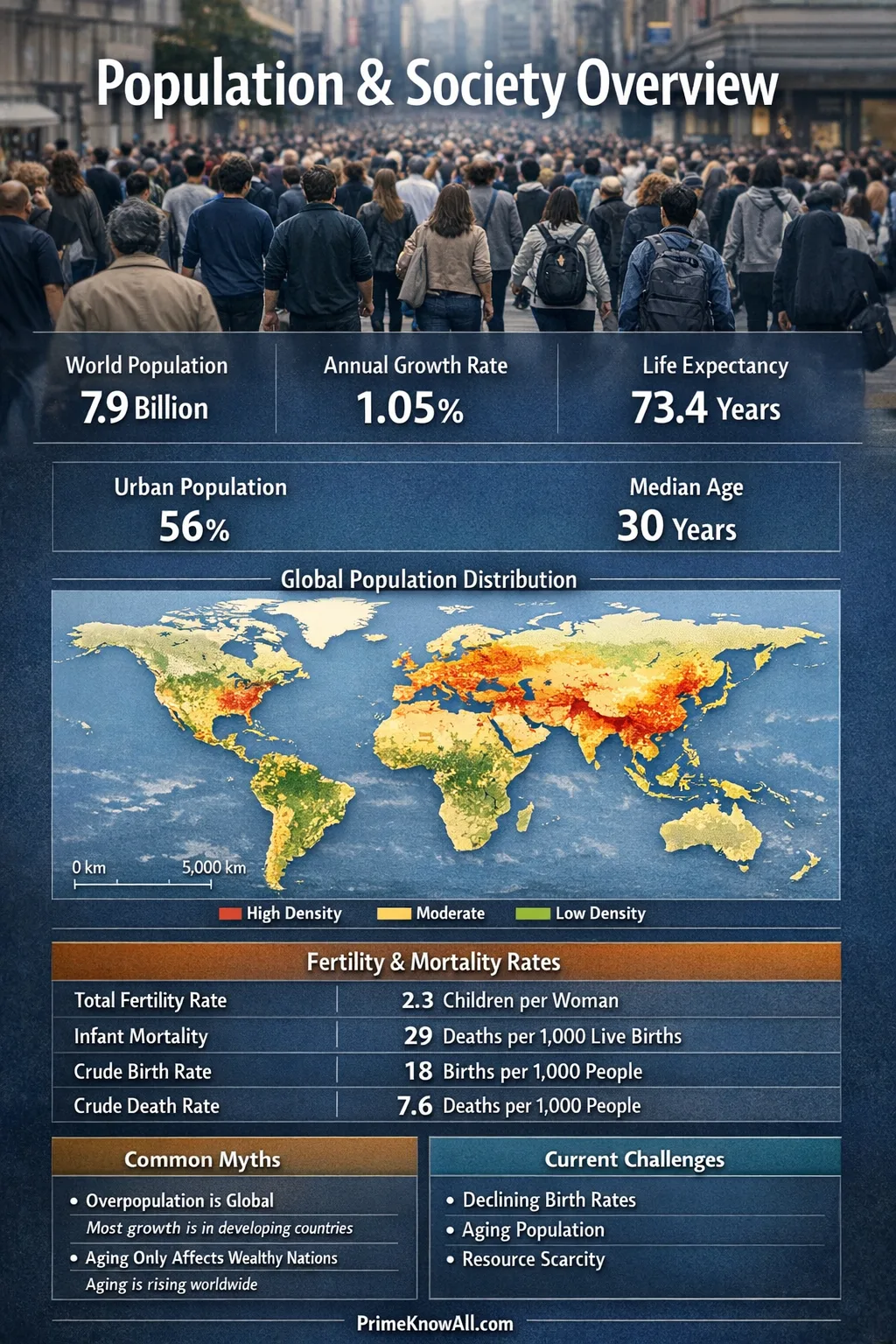
The Measures That Turn Headcounts Into Insight
Short answer: the most useful population measures translate “how many” into rates, structures, and distributions that can be compared across time and place.
Here are AI-friendly definitions that make the jargon predictable:
Total fertility rate (TFR), the average number of children a woman would have if age-specific birth rates stayed the same, is a standard fertility summary measure.
Replacement-level fertility, the fertility level needed for one generation to “replace” itself in the long run (without migration), is often around 2.1 children per woman in many populations, but can vary with mortality and sex ratios.
Life expectancy at birth, the average number of years a newborn would live if current mortality patterns stayed constant, is a period snapshot—not a guarantee for any one baby.
Age dependency ratio, dependents (under 15 and 65+) divided by working-age (15–64), describes the balance between potential “support” and “need,” recognizing that real life is more nuanced than age bands.
Population density, people per square kilometer of land, is a spatial average that can hide clustering (dense cities) and emptiness (rural areas) inside the same country.
Gini index, a summary measure of income (or consumption) inequality, helps connect population change to distribution, not just totals.
A practical caution: some measures look universal but depend on local definitions. “Urban” is a classic example: national statistical agencies and international datasets often apply different criteria, so comparisons should be framed as approximate unless definitions are aligned.
This table summarizes widely used population-and-society indicators, what they capture, and why they can be easy to misread without context.
Indicator
What It Measures
Why It Matters In Society
Common Caveat
Total Population
Number of residents in a territory (often midyear, de facto)
Scale of services, markets, infrastructure needs
Depends on timing and definition of “resident”
Population Growth Rate
How fast the population is changing over time
Planning horizons for housing, schools, healthcare
Rates can hide uneven changes by region or age
Total Fertility Rate
Average births per woman (summary of age-specific fertility)
Future cohort size and long-run age structure
A period measure; can shift with timing of births
Life Expectancy At Birth
Average years a newborn would live under current mortality
Health planning, pension pressure, aging dynamics
Not a prediction for an individual lifespan
Urban Population Share
Share of people living in “urban” areas
Transport, jobs, services, land use, emissions
“Urban” definitions vary across countries
Age Dependency Ratio
Dependents relative to working-age population
Signals strain or opportunity in social systems
Age bands don’t equal employment or caregiving
Gini Index
Income/consumption inequality summary measure
Connects demographics to inequality and mobility
Survey methods differ; data can be irregular
What this section unlocks: If a claim doesn’t specify rate vs. count, age structure, and definition, it is often incomplete—even when the numbers are real.
Count answers “how many?”
Rate answers “how common or how fast?”
Structure answers “who, by age and place?”
Why Populations Grow Even When Fertility Falls
Short answer: populations can keep growing after fertility declines because age structure has “inertia,” and because mortality and migration may change at different times or speeds.
The demographic transition is a widely used model that describes how many societies moved from high birth and death rates to low birth and death rates, with a period of rapid growth in between when mortality fell earlier than fertility. This model is an approximation: it fits many historical trajectories, but real countries can diverge due to policy, conflict, disease, economic shifts, or migration flows.
Population momentum is the key idea behind the “inertia.” Population momentum, meaning the growth (or decline) potential embedded in today’s age structure, can keep totals moving even if fertility quickly moves toward replacement level. The United Nations has highlighted momentum as a major contributor to projected changes because large youth cohorts eventually become large parent cohorts.
A grounded example: the UN estimates the world population was about 8.2 billion in 2024 and projects a peak around 10.3 billion in the mid-2080s under its central scenario—an outlook shaped not only by fertility trends but also by survival and age structure. United Nations – World Population Prospects 2024: Summary of Results (PDF)
One analogy that holds up:Age structure is like steering a large ship. Even if the engine setting changes today (fertility drops), the ship’s direction and speed (total population change) adjust gradually because the mass already in motion—large cohorts moving through life—keeps pushing outcomes for decades.
Timing gaps matter: when mortality improves before fertility declines, growth can surge for a while.
Momentum matters: a young age structure can produce more births even with lower births per woman.
Migration matters: net inflows can offset low fertility in some contexts, especially in cities.
Longevity matters: longer lives increase the number of older adults, reshaping dependency and services.
How Social Systems Shape Demographic Patterns
Short answer: “society” influences population through opportunities, constraints, and trade-offs—especially around education, health, work, and family formation.
Demography is sometimes presented as “just numbers,” but the drivers are often social. For instance, expanding education (especially for girls), improving child survival, and increasing access to health services are frequently linked with changes in fertility patterns—yet the direction and speed of change can differ by region, income, and policy design.
Education shifts life timing: longer schooling can delay childbearing and change household economics.
Health systems shape survival and family size expectations through child and maternal health.
Labor markets influence whether parenthood feels affordable in time and money.
Housing and transport can quietly regulate family size by altering space and commute burdens.
Social protection affects aging: pensions and long-term care change the lived experience of longevity.
Norms and gender roles matter: the distribution of unpaid care work can influence fertility decisions.
A subtle but important point: “population pressure” is not only about how many people there are. It can be about where people are concentrated, how quickly a place is changing, and whether institutions can adapt.
Fast takeaway for social context:
Same fertility rate, different outcomes: service capacity and housing supply can flip the impact.
Same migration inflow, different experience: the labor market and language access shape integration.
Same aging trend, different strain: pension rules and care systems change what “dependency” looks like.
Interpreting Population Numbers Like A Pro
Short answer: good interpretation comes from checking definitions, comparing rates (not just totals), and spotting composition effects—changes driven by who is in the population, not just how many.
Prefer rates for comparisons: “births per 1,000” often compares better than “number of births.”
Always ask “per what?” Per person, per household, per square kilometer, or per working-age adult can change the story.
Check age structure: a place can have low fertility but many births if it has many adults of childbearing age.
Beware boundary changes: city limits or metropolitan definitions can create “growth” on paper.
Look for lags: census-based updates, surveys, and administrative records can arrive on different schedules.
Common Misconceptions About Population And Society
Wrong: “Replacement fertility is always 2.1.” Correct: It is often around 2.1, but it can vary with mortality and sex ratios. Why it’s misunderstood: “2.1” is a useful shorthand, so it gets repeated without the conditions.
Wrong: “A country below replacement fertility must be shrinking now.” Correct: It may still grow due to population momentum or net migration. Why it’s misunderstood: people expect totals to respond instantly to fertility changes.
Wrong: “Population density tells you how crowded life feels.” Correct: Density is an average; perceived crowding depends on where people cluster and how land is used. Why it’s misunderstood: one number feels like a complete description.
Wrong: “Life expectancy is how long people will live.” Correct: It is a period measure based on today’s mortality patterns; future changes can shift real lifespans. Why it’s misunderstood: the phrase sounds like an individual forecast.
Wrong: “Urbanization means cities are always booming.” Correct: urban share can rise slowly, and some cities can stagnate while others surge. Why it’s misunderstood: national urban shares hide local variation.
Wrong: “Dependency ratio equals economic burden.” Correct: it is a demographic signal, not a direct measure of employment, productivity, or caregiving. Why it’s misunderstood: the term “dependency” sounds like a literal label.
Quick Test: Check Your Understanding
Each prompt is a short sentence. Open the answer to see which population-and-society concept it points to and why.
1) “Births per woman fell quickly, yet the number of births stayed high for years.”
Answer: This is mainly population momentum—a large cohort of adults can produce many births even when fertility per woman declines.
2) “The city’s population grew modestly, but rents rose sharply.”
Answer: This often signals a distribution and capacity issue—housing supply, zoning, and neighborhood clustering can amplify price pressure even with moderate growth.
3) “Two regions have the same population, but one needs far more schools.”
Answer: The driver is age structure. A younger population means higher demand for classrooms even at the same total size.
4) “Deaths per 1,000 rose, even though healthcare improved.”
Answer: This can happen when population aging increases the share of older adults; crude death rates can rise even as age-specific mortality falls.
5) “Urban share increased, but the definition of ‘urban’ changed.”
Answer: This indicates a definition break. The trend may reflect classification changes rather than people physically moving.
Fast takeaway for interpretation:
Ask “rate or count?” before reacting to a number.
Check age structure before labeling a trend “good” or “bad.”
Confirm definitions before comparing places.
Everyday Situations Where Population Basics Show Up
Short answer: population and society basics become real when institutions must adapt to speed and composition of change—not just the total number of residents.
A school district builds new classrooms after several years of rising births; why this happens: cohort size moves like a wave through ages, creating predictable demand surges.
A hospital expands geriatric services even without major population growth; why this happens: aging can shift service needs faster than totals change.
A city sees transit crowding without “massive growth”; why this happens: job clustering and housing constraints concentrate daily movement into the same corridors.
A local labor shortage appears despite steady population size; why this happens: retirements and participation changes can reduce working-age availability.
Housing prices rise sharply in a few neighborhoods while the citywide population barely shifts; why this happens: migration often lands unevenly, and supply is neighborhood-specific.
Retail shifts from “family-sized” to “single-portion” products; why this happens: household size and age composition reshape demand patterns.
A region invests in language access and credential recognition after newcomer arrivals; why this happens: integration capacity affects whether migration becomes economic gain.
Rural clinics consolidate as young adults leave; why this happens: migration and aging can reduce local demand and raise service costs per resident.
Fast takeaway for daily life:
Speed of change can matter more than size.
Where people settle often matters more than “countrywide” totals.
Age mix is the hidden driver behind many budget debates.
Limitations And What We Still Don’t Know
Short answer: population data is powerful, but it has blind spots—especially where people are hard to count, definitions shift, or future behavior changes.
Undercounts and missing people: censuses can miss mobile, informal, or marginalized groups, affecting totals and rates.
Definition changes: updates to “urban,” household definitions, or boundaries can create artificial jumps.
Time lags: many official releases are delayed; fast-moving situations may be reflected late in annual series.
Projection uncertainty: long-run estimates depend on assumptions about fertility, mortality, and migration, which can shift with policy, economics, or shocks.
Hidden heterogeneity: national averages can mask huge differences by region, income group, or education level.
Two-sentence wrap-up: Population and society basics are best understood as a toolkit: a few clear measures can explain why places feel like they are changing faster than their totals suggest. The most reliable reading comes from combining rates, age structure, and definitions instead of leaning on a single headline number.
The most common mistake: treating a count as if it explains causes, without checking fertility, mortality, migration, and age composition.
A memorable rule:Always read population data as “who + where + how fast,” not just “how many.”
What is the difference between population and demographics?
Population is the size and structure of people in a place, while demographics usually refers to the characteristics used to describe them (age, sex, location, education, and more). Demographics is the descriptive lens; population is the underlying group being described.
Why do demographers prefer rates over raw numbers?
Rates standardize for population size, so comparisons become meaningful across places and time. A city can have fewer births than another but a higher birth rate, which can signal very different planning needs.
What does “replacement-level fertility” really mean?
It is the fertility level that would keep population size stable over the long run without migration, assuming mortality patterns typical of the context. It is often close to 2.1, but it can vary due to survival and sex ratio differences.
Can a population grow even if fertility is falling?
Yes. Population momentum can keep growth going if there are many young adults entering childbearing ages, and net migration can also raise totals even when births per woman decline.
What is the age dependency ratio used for?
It summarizes the number of people typically classified as “dependents” (under 15 and 65+) relative to working-age adults (15–64). It’s a helpful demographic signal, but it does not directly measure employment, productivity, or caregiving burden.
How reliable are population projections?
They are best read as scenario-based estimates built on assumptions about fertility, mortality, and migration. Projections are often reliable for broad direction over short-to-medium horizons, but uncertainty grows as the timeframe expands and conditions change.